Designing for Parallel User Journeys
Led UX/UI design, system development, and execution to bring the Natroba website through development and launch
Visit live site
Role
UX/UI Designer
Timeline
5 months
Tools
Figma, Adobe Suite
Team
Creative Director, UX, Devs
Understanding the challenge.
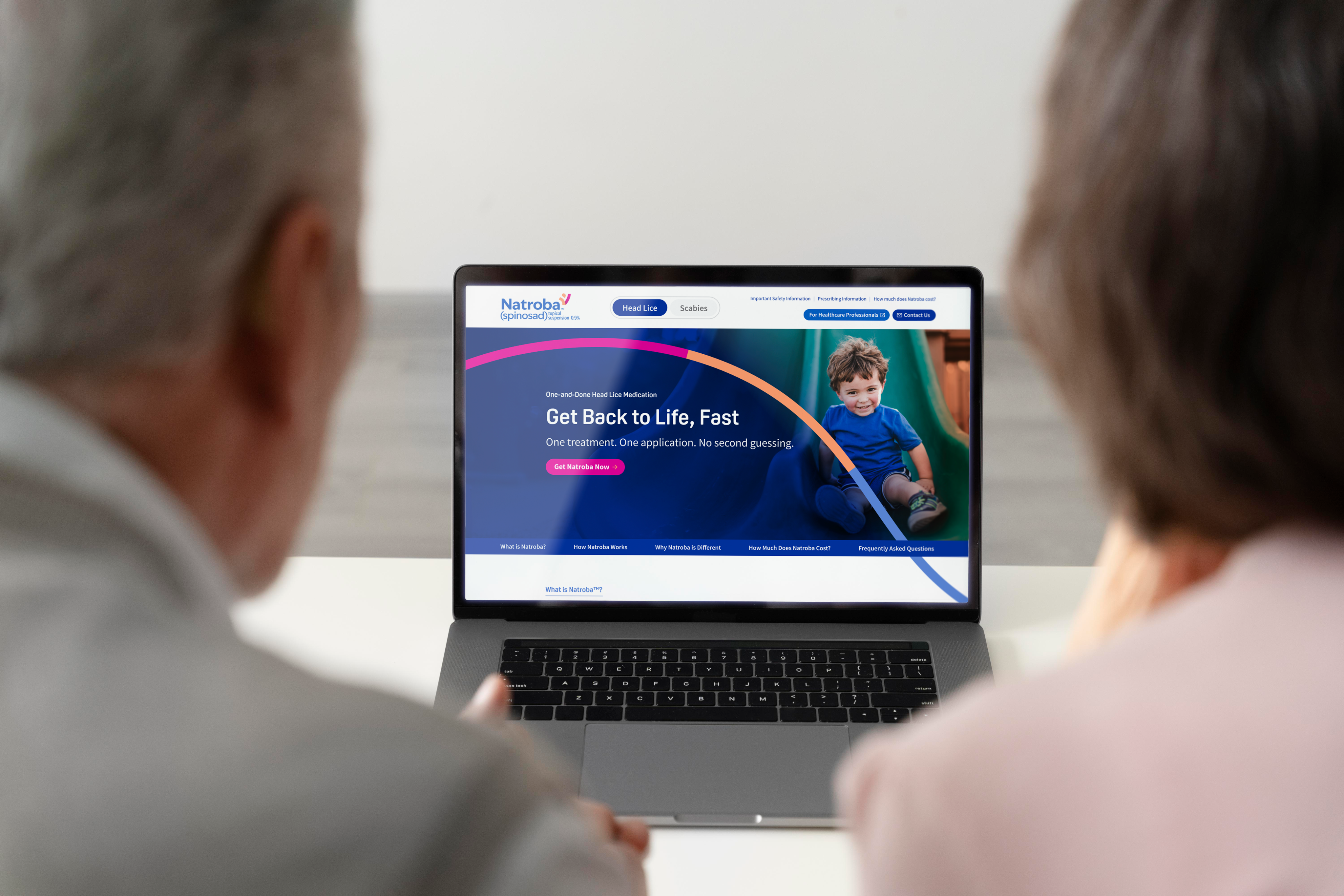
When I joined the Natroba website project, the foundation was already established through initial wireframes and early layouts. However, the experience lacked consistency, scalability, and the level of detail needed to move into development.
The challenge was to bring structure and clarity to an experience already in motion, while continuing to move the work forward.
When a product is already in motion, clarity is critical. Momentum without clarity leads to inconsistency.
Owning the experience.
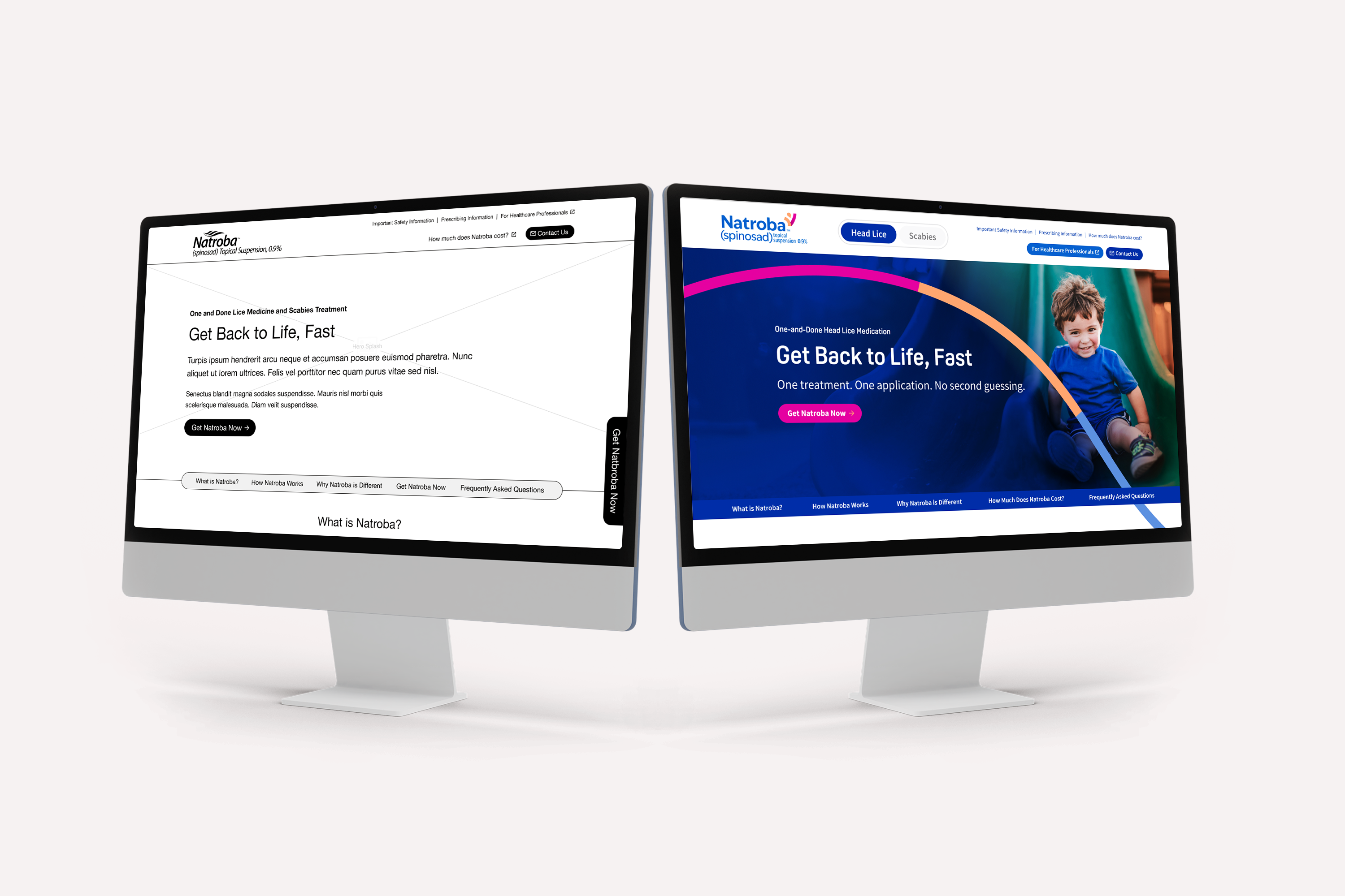
I took ownership of the design by evolving the existing framework into a cohesive, fully realized product.
This included refining user flows, improving hierarchy, and introducing a system of reusable components that could scale across the site. I worked across pages and states to ensure the experience felt consistent, intentional, and complete.
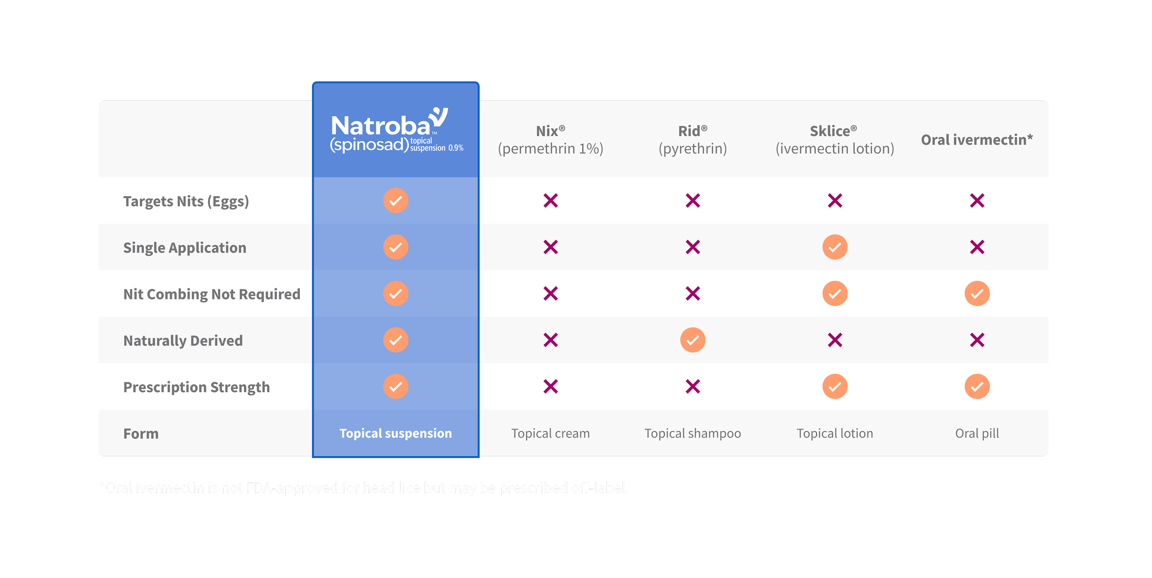
Refining the system.
To create consistency across the experience, I developed a set of reusable components and standardized layout patterns.
This system allowed content to scale while maintaining clarity and visual cohesion. I also introduced missing interaction states, responsive behaviors, and edge cases, ensuring the product was ready for real-world use.
Scalability comes from defining patterns, not designing more screens.

Defining two paths.
Natroba treats both scabies and lice; two conditions with distinct user needs and intent. Early in the experience, this information was presented together, making it difficult for users to quickly find what was relevant to them.
I restructured the experience to clearly separate these paths, allowing users to quickly identify where to go while maintaining a consistent system across both.
Each path delivers targeted content, but follows the same structural logic, ensuring clarity without creating fragmentation.
Different user needs require distinct paths, not more content competing for attention within the same experience.


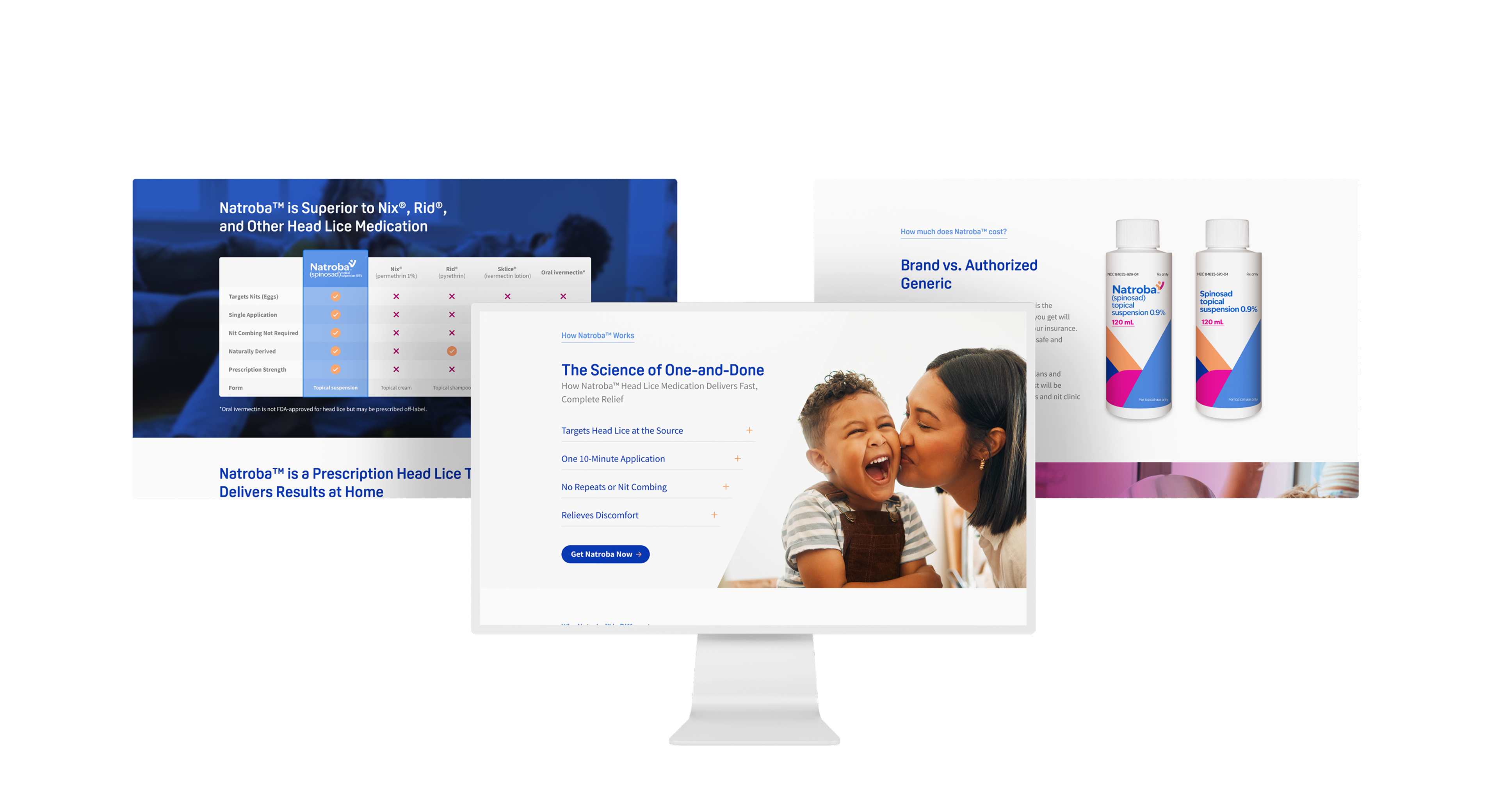
Building a cohesive layout.
A flexible system was key to supporting both condition-specific content and the broader site experience.
I created modular layouts and reusable content blocks that could adapt across pages while maintaining consistency. This ensured the experience remained cohesive, regardless of content differences.
Guiding implementation.
To bring the design to life, I worked closely with developers throughout the build process.
I prepared organized, developer-ready files, defined component behavior, and ensured responsive states were clearly documented. During implementation, I collaborated to resolve edge cases and maintain design integrity.
Design doesn’t end at handoff, it continues through implementation.
Delivering the final product.
The Natroba website was successfully brought to completion and prepared for launch.
Through structure, systemization, and thoughtful execution, the final product delivers a cohesive, scalable, and user-focused experience.
View live site
Created with care.
ッ I’m happy you’re here. I hope you found something worth taking with you.
Designing for Parallel User Journeys
Led UX/UI design, system development, and execution to bring the Natroba website through development and launch
Visit live site
Role
UX/UI Designer
Timeline
5 months
Tools
Figma, Adobe Suite
Team
Creative Director, UX, Devs
Understanding the challenge.
When I joined the Natroba website project, the foundation was already established through initial wireframes and early layouts. However, the experience lacked consistency, scalability, and the level of detail needed to move into development.
The challenge was to bring structure and clarity to an experience already in motion, while continuing to move the work forward.
When a product is already in motion, clarity is critical. Momentum without clarity leads to inconsistency.
Owning the experience.
I took ownership of the design by evolving the existing framework into a cohesive, fully realized product.
This included refining user flows, improving hierarchy, and introducing a system of reusable components that could scale across the site. I worked across pages and states to ensure the experience felt consistent, intentional, and complete.
Refining the system.
To create consistency across the experience, I developed a set of reusable components and standardized layout patterns.
This system allowed content to scale while maintaining clarity and visual cohesion. I also introduced missing interaction states, responsive behaviors, and edge cases, ensuring the product was ready for real-world use.
Scalability comes from defining patterns, not designing more screens.
Defining two paths.
Natroba treats both scabies and lice; two conditions with distinct user needs and intent. Early in the experience, this information was presented together, making it difficult for users to quickly find what was relevant to them.
I restructured the experience to clearly separate these paths, allowing users to quickly identify where to go while maintaining a consistent system across both.
Each path delivers targeted content, but follows the same structural logic, ensuring clarity without creating fragmentation.
Different user needs require distinct paths, not more content competing for attention within the same experience.
Building a cohesive layout.
A flexible system was key to supporting both condition-specific content and the broader site experience.
I created modular layouts and reusable content blocks that could adapt across pages while maintaining consistency. This ensured the experience remained cohesive, regardless of content differences.
Guiding implementation.
To bring the design to life, I worked closely with developers throughout the build process.
I prepared organized, developer-ready files, defined component behavior, and ensured responsive states were clearly documented. During implementation, I collaborated to resolve edge cases and maintain design integrity.
Design doesn’t end at handoff, it continues through implementation.
Delivering the final product.
The Natroba website was successfully brought to completion and prepared for launch.
Through structure, systemization, and thoughtful execution, the final product delivers a cohesive, scalable, and user-focused experience.
View live site
Created with care.
ッ I’m happy you’re here. I hope you found something worth taking with you.